
Component Libraries
FacetUI
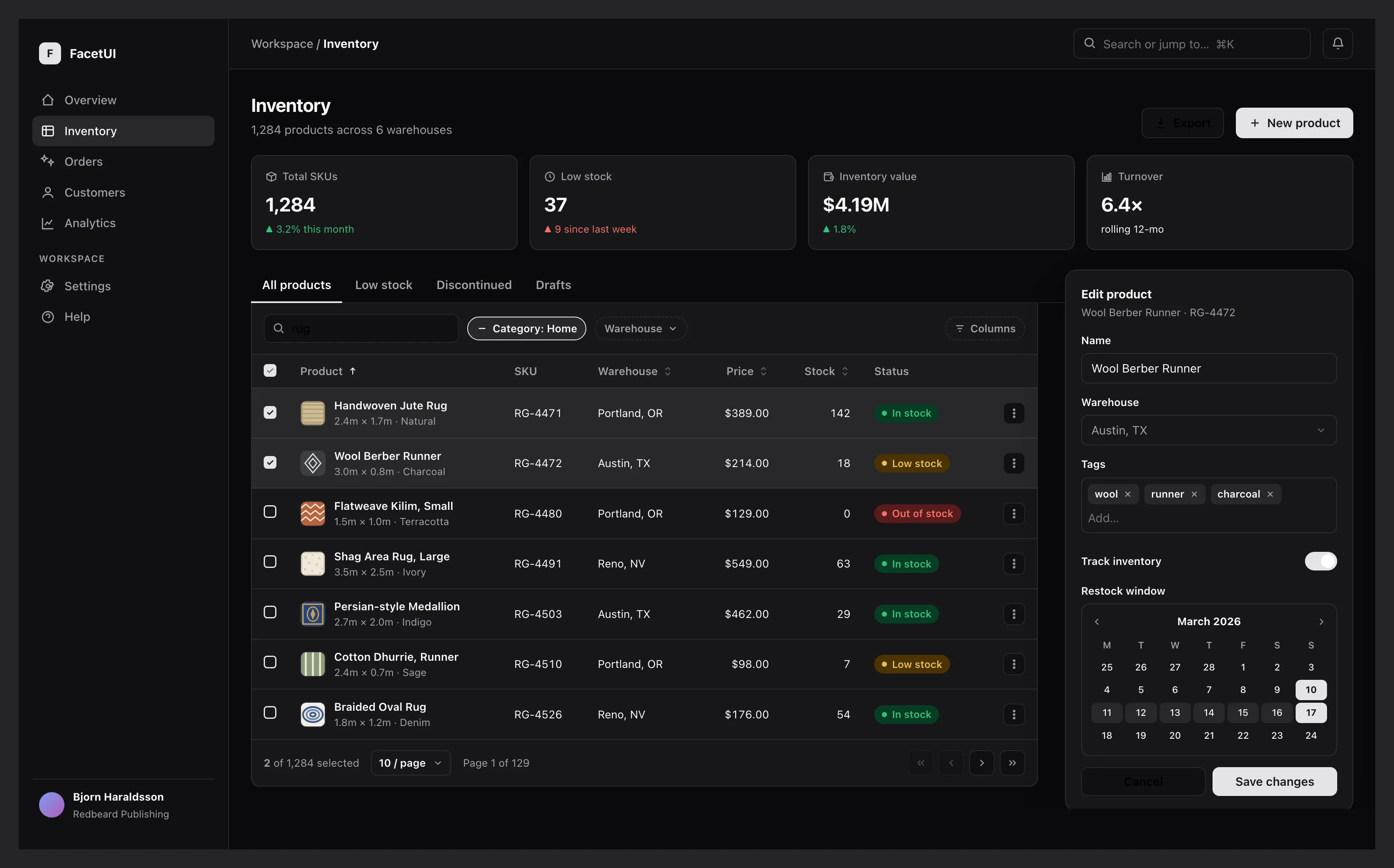
The Challenge
Feature-rich component libraries lock a product into their look; headless primitives hand back correct behaviour but leave every team re-implementing keyboard support, focus management and screen-reader semantics — usually after a support ticket.
The Solution
FacetUI fixes behaviour and accessibility in and makes them non-negotiable — built on React Aria and TanStack's headless engines — then hands the whole styling surface to the consumer through Tailwind v4 and roughly a dozen semantic OKLCH tokens. Each component is exposed at three levels over one engine: a composed drop-in, its primitives, and the raw state hook, so it fits a content team wiring up a CMS front-end and a product engineer who needs total control of the render layer.
Technologies Used
React Aria
Keyboard, focus management and screen-reader semantics under every component.
TanStack headless engines
Data grid, virtualisation and table logic with no render layer of their own.
Tailwind CSS v4
The entire styling surface — every visual detail is a class the consumer controls.
OKLCH design tokens
~12 semantic tokens that drop straight into an existing shadcn/ui theme.
In developmentNot yet available to the public — details and links will appear here at release.